The Power of What You Leave Out: Understanding White Space as a Design Element

Embracing the Void
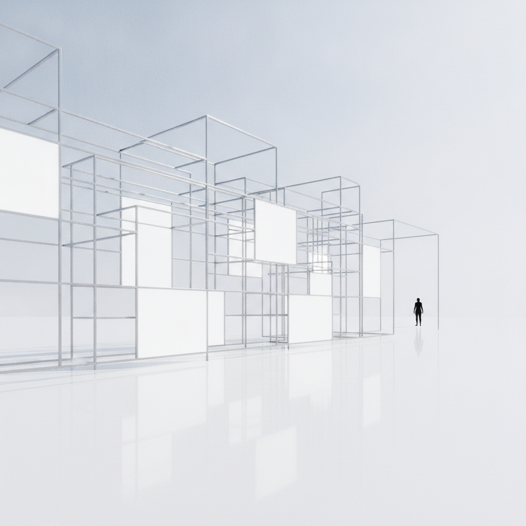
In the world of design, less is often more. White space, or negative space, is a crucial element that can make or break the effectiveness of a design. While it may seem counterintuitive to some, the power of what you leave out can enhance the overall aesthetic and functional quality of any visual composition.
Defining White SpaceWhite space refers to the areas in a design that are intentionally left blank, devoid of any text or images. It is not merely empty space; rather, it serves a significant purpose in guiding the viewer's eye, organizing content, and creating balance. When used effectively, white space can bring clarity and focus to the elements that are present.
"White space is to be regarded as an active element, not a passive one." - Jan Tschichold
Enhancing Readability and Comprehension
One of the primary functions of white space is to improve readability. By providing ample breathing room around text, designers can help users navigate content more easily. This is particularly vital in web design, where users often scan rather than read every word. Clear separation between paragraphs, headings, and images can aid comprehension, making it easier for the audience to absorb information quickly.
 Creating Visual Hierarchy
White space also plays a vital role in establishing a visual hierarchy. By strategically placing space between elements, designers can guide viewers to the most important parts of the design. For instance, increased white space around a call-to-action button can draw attention and encourage user interaction. This intentional use of negative space helps prioritize content, ensuring that critical elements stand out.
Fostering Emotional Connection
Beyond functionality, white space can evoke emotions and create a specific atmosphere. Designs with ample white space often feel more modern and sophisticated, leaving a lasting impression on users. The feeling of spaciousness can convey a sense of tranquility and calm, making it an ideal choice for brands aiming to project a clean and minimalist aesthetic.
Encouraging FocusMoreover, when distractions are minimized through the use of white space, the viewer's attention is directed towards the message being conveyed. In a world inundated with visual noise, leveraging negative space can create a sanctuary of focus, allowing the essential elements to shine without competition. This intentional curation of space can make a significant difference in how a design resonates with its audience.
"Design is not just what it looks like and feels like. Design is how it works." - Steve Jobs
Conclusion
Incorporating white space as a design element is a powerful strategy that can enhance both aesthetics and functionality. It promotes readability, establishes visual hierarchy, fosters emotional connections, and encourages focus. By understanding and harnessing the potential of what you leave out, designers can create compelling compositions that engage and resonate with viewers on a deeper level. In the end, sometimes, it's the space between the elements that speaks the loudest.