Techniques of Layout Composition Borrowed from Film and Photography

Exploring Visual Harmony in Design
In the world of graphic design, layout composition plays a pivotal role in conveying messages effectively. Drawing inspiration from film and photography can elevate the visual storytelling in any design project. Here, we delve into several techniques that can help create more dynamic and engaging layouts.
1. Rule of ThirdsThe rule of thirds is a fundamental principle in both photography and film that can be applied to layout design. By dividing your canvas into a 3x3 grid, you can place key elements along the lines or at their intersections. This technique naturally guides the viewer’s eye across the composition and creates a more balanced visual experience.
2. Leading LinesLeading lines are used in photography to draw the viewer’s gaze toward the focal point. In layout design, incorporating lines—be it through text arrangement, borders, or graphical elements—can help steer the audience's attention where you want it to go, enhancing the flow of information.
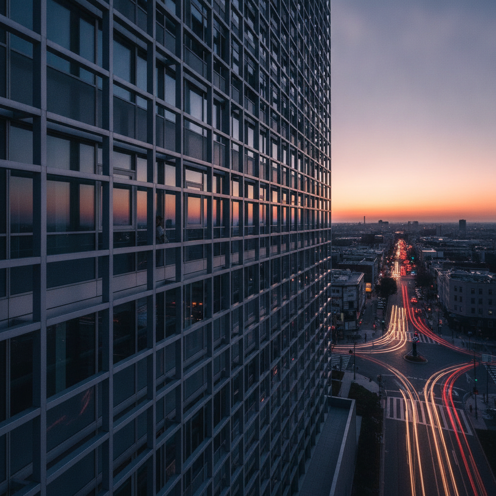 3. Framing
Just as filmmakers use framing to focus attention on a subject, designers can utilize negative space and borders to highlight key elements in a layout. By strategically placing elements within a frame, you can create a sense of importance and clarity, making it easier for viewers to comprehend the focal points.
“Good design is all about making choices that enhance the user experience without overwhelming them.”4. Contrast and Color Grading
Contrast is a powerful tool in both film and photography for emphasizing certain aspects of a scene. In layout design, contrasting colors, sizes, and shapes can create visual hierarchy, guiding the viewer's attention to the most important information. Additionally, color grading techniques can set the mood and tone of a layout, establishing an emotional connection with the audience.
5. AsymmetryAsymmetrical compositions can evoke a sense of movement and dynamism, often seen in modern films and art photography. By intentionally placing elements unevenly, designers can create visual tension that encourages exploration and engagement, making the layout feel more alive and interesting.
Conclusion
By incorporating composition techniques from film and photography into layout design, creators can significantly enhance their visual storytelling. Understanding and applying these principles not only improves the aesthetic appeal but also enriches the overall user experience. Explore these techniques, experiment with your layouts, and watch how your designs transform into compelling narratives.